Find Our Latest Video Reviews on YouTube!
If you want to stay on top of all of our video reviews of the latest tech, be sure to check out and subscribe to the Gear Live YouTube channel, hosted by Andru Edwards! It’s free!
Wednesday December 9, 2009 9:20 pm
Barnes & Noble nook review
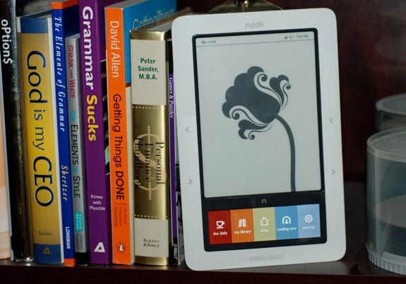
We’ve been anticipating the nook for about a month-and-a-half now, even since Barnes & Noble announced the nook back in October. Seeing a potential, real competitor to the Amazon Kindle sporting both an e-ink screen alongside a capacitive color LCD touchscreen just about made us drool. Oh, and it runs Google Android too, so, there’s that whole thing. Well, we’ve finally got the Barnes & Noble nook into our hands, and we’ve done some testing, some reading, and some playing, all in the spirit of letting you know how the nook stands on its own, and how it compares to the Amazon Kindle. We think we’ve done that, and we invite you to continue reading for the full Gear Live nook review.
THE BATTLE
Okay, before we actually get into the nook review itself, we think it’s appropriate to set the stage at this point. Yes, we realize that there are a lot of ebook readers out there. You have the Amazon Kindle, the Sony Readers, the Barnes & Noble nook, and a host of others. It’s time to be up front right now. With the ebook readers available today, we have to say that 99% of you should focus only on the Kindle and the nook. If you’d rather find your ebooks on torrent sites, or only want old out-of-copyright works, then sure, take a look at the others. However, if you want a device that’ll pull books down quickly from an embedded store on the fly, with 3G access built-in, you have two choices - Kindle and nook. Luckily, both are decent choices.
Of course, here we are focusing on the B&N nook. What you’ve got here is Barnes & Noble’s attempt to take on the Amazon Kindle. What sets it apart is the fact that it rocks two displays: one is the standard e-ink display that you read your books on, and the other is a capacitive touchscreen LCD, used for navigating the menus, shopping, and playing around with settings on the device. The goal here is to eliminate the physical keyboard, while also not breaking the bank with an all-out touchscreen e-ink display. Compare this to the Sony Reader, which has a shiny film over the e-ink display, which can be annoying, but gives it a pseudo-touchscreen feel. The Kindle has a screen, keyboard, and jog dial that is used to navigating around - but many find that to be a bit too slow. The thing is, the nook isn’t exactly a speed demon itself. It’s still early, though, and we bet a software update or two will be able to optimize the experience of that second screen. That said, we do like the second screen, and we do find that typing on the keyboard, for exampling, is definitely faster than doing the same task on the Kindle.
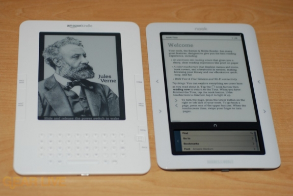
We are filing the secondary nook LCD screen under the “has potential” category for now. It definitely helps, and can do some things that just can’t be done on the Kindle (like browsing full-color book covers,) and we bet that B&N may have a few more tricks up their sleeve for the device. We do know that they are hard at work on the first over-the-air nook update, which shouldn’t be more than a few weeks away from deployment.
So, does the nook LCD screen and its “has potential” status mean that you shouldn’t get a nook just yet? No, not so fast. Let’s not be hasty, no need to jump to conclusions and all that. If you are one of the early pre-orders, you should be receiving your nook by today or tomorrow, if you haven’t already received it, and you’ll see that there’s nothing wrong with it at all. The fact is just that there is more that can be done, Barnes & Noble knows that, and therefore there is more to come. As it stands today, however, it still matches up very nicely with the Kindle, and Amazon should be a little concerned.
Gallery:
THE DISPLAYS
Another thing we should get our of the way is that the nook e-ink display is pretty much the same display that you find on the Kindle. One is not better than the other. At the end of the day, when you think about that, you realize that the primary use of the device, that being reading books, is the same on each. So it really becomes more about the user interface and the book catalogue, as well as any differentiating special features.
INTERFACE AND NAVIGATION
Okay, so the nook primarily uses the secondary LCD touchscreen for moving around through the interface. The thing about this is that it requires a bit more learning before you can easily navigate through the device, especially since the screen changes depending on what it is you are trying to accomplish. The way the Kindle does it, all the keys are there on the device, so they are all there for you to get to, even if you have to dig into a menu. With the nook, you kind of have to figure out where it is you want to go. It’s not like it’s truly a difficult task, and after a day or two it should feel a lot more natural - but when it comes to picking up the device and just “knowing” what to do with it, the Kindle wins that battle.
So, what then, are the benefits of having the LCD if it has a steeper learning curve? Well, it can do more stuff. You can browse books in a Cover Flow-esque fashion in full color, and you don’t have to wait for screen refreshes when typing like you do on the Kindle, for starters. So it lets you move around a bit faster. It’s also easier on the fingers, in my opinion, since it’s a capacitive touchscreen that doesn’t require more than a light touch to input commands.
There is a bit of sluggishness as it pertains to the swipe gesture that can be used for turning pages, rather than using the actual hardware buttons on the device. There is a bit os a slight waiting period that just doesn’t feel as natural as when you press the physical buttons on the sides of the screen on the nook. B&N says they are well aware, and that speeding up the LCD input is at the top of the list for the soon-to-come software update. In fact, if you didn’t pre-order a nook, we’d be willing to bet that by the time they are available in stores, this will no longer be an issue.
Also, remember that the nook runs Android, and Barnes & Noble says that this means that developers will be able to write applications for this thing. Obviously, there aren’t any yet…but if we think about it, we can imagine a streaming radio app, or something to get Facebook or Twitter status messages on the LCD. Really, there can be some pretty interesting apps here that we haven’t even thought of. First, though, let’s get this thing to a point where the LCD is nice and fluid.
FEATURES AND SERVICES
Let’s talk about some of the cool features that this thing offers. First, you get native PDF support. We don’t generally load PDFs onto our eBook readers, but I chose a random PDF and it looked just fine. I know many wonder about that, so there you go. You also have a built-in music player, which is completely controlled by the touchscreen, and is at the bottom of the main menu areas.
The nook sports built-in Wi-Fi, something the Kindle can’t boast. This allows you to use your network connection rather than relying on AT&T 3G service. So if you are out of the country, or just have no AT&T signal, you can still access the bookstore, download books, etc.
More interestingly, the nook features the LendMe feature, which literally allows you to lend one of your ebooks to another B&N ebook user. The shared book can be viewed on another nook device, in the B&N iPhone app, or one of the Mac or PC desktop reader applications. The person then has up to two weeks to read the book, and while it is lent out, you can’t read it yourself. After the loan period, that’s it. You can read it again, and you cannot ever lend it again. We don’t like that last part, and we are guessing competition from Amazon is going to do away with it. The point of LendMe is to make eBook seem more like real books, so putting a one-time limit on them, when I can lend a real book however many times I’d like to, seem silly. One note, we weren’t yet able to test this feature, as it’s still in process of being rolled out.
Another cool and unique service offered by the nook that no other competing ebook reader can offer is the in-store Barnes & Noble experience. If you walk into a B&N store with your nook and connect to the Wi-Fi, you are instantly able to pull up any book on your nook and start reading it. You get two hours of access to each book, per day. That is pretty liberal if you ask us. It also lets you compare the real version of a book to the digital version, side-by-side, with no cost. That puts the nook in a very unique position. Oh, and you’ll also get free downloads, coupons and freebies from the cafe, etc. We like this feature.
Lastly, in addition to the B&N Bookstore offerings, the nook also integrates Google Books. This gives you access to download over 500,000 books from Google’s collection of public domain book reprints. These are completely free, despite not being anything near timely. We did find some great classics in there though.
Gallery:
FINAL VERDICT
I know it looks like we spent a lot of time picking apart the nook, but really, that’s what’s expected in a review. However, admittedly, the gripes listed are all fairly small, and will soon be gone with the first software update (or so we’re told.) Quite honestly, we like the outlook of the nook. We think that, with Android as the foundation, we will see new features and customization options that other ebook readers simply can’t offer right now. We also love the whole B&N in-store experience and the lending feature, even if it is kind of crippled right out of the gate.
Barnes & Noble is definitely in this game to compete, rather than to be an also-ran, and the nook makes that very apparent. Is it better than the Kindle? We’d say no, but with an asterisk. That asterisk would say that the Kindle isn’t better than the nook either. What we have here are two devices that are optimized for reading and purchasing ebooks, and each does this very well. They are different enough to be alternatives to each other in terms of the hardware experience.
All that said, we think Amazon is going to need to react fairly quickly. What you have in the nook is a device that, like the iPhone, is built on an operating system that gives it a bit of future-proofing. What you get with the nook today is less than what you will be able to do with it over the next few months, as B&N releases more features, and eventually, downloadable applications. They’ve also got the advantage of the Google Books catalog and the whole in-store experience. The Kindle simply doesn’t have all that.
So you need to ask yourself if you’ll ever use those features that the nook has to offer. If the answer is no, then really, it’s a toss up. The devices cost the same, and it goes to personal preference - but even there, the nook wins because you’ll be able to walk into any Barnes & Noble store and pick one up to use it. If you want to do that with a Kindle, you’ll need to find a friend that happens to own one for you to get your hands on it.
Now, stepping outside of the nook vs. Kindle debate, is the nook a worthy eBook reader?
Yes.
If the Kindle didn’t exist, we’d recommend this one, hands down. Even while the Kindle does exist, it holds its own, and if I were to have to choose one to buy for myself or as a gift, at this point, I’d choose the nook. Sure, there are frustrating points about it, but it’s mostly all interface. At the end of the day, the thing you’ll spend most of your time doing on the device is reading books, and for that, it’s superb.
Latest Gear Live Videos
Advertisement
Advertisement
Advertisement
© Gear Live Inc. {year} – User-posted content, unless source is quoted, is licensed under a Creative Commons Public Domain License. Gear Live graphics, logos, designs, page headers, button icons, videos, articles, blogs, forums, scripts and other service names are the trademarks of Gear Live Inc.


