Find Our Latest Video Reviews on YouTube!
If you want to stay on top of all of our video reviews of the latest tech, be sure to check out and subscribe to the Gear Live YouTube channel, hosted by Andru Edwards! It’s free!
Monday August 31, 2009 5:30 pm
Mac OS X 10.6 Snow Leopard Review (with video!)

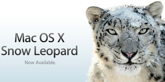
Mac owners, the time for upgrading is upon as, as Mac OS X 10.6 Snow Leopard is now available on a worldwide basis. If you didn’t know that there was a new operating system from Apple today, we wouldn’t blame you, because it’s kind of been released without much fanfare. You see, Snow Leopard is all about fine tuning, refining, and improving upon OS X 10.5 Leopard. It’s a makeover that, at first glance, seems underwhelming because the majority of the changes occur “under the hood” so to speak.
So, what can you expect? Well, if you’ve used an iPhone 3G and an iPhone 3GS, think of it in those terms. They are really pretty much the same product, but the 3GS is much snappier, and has a couple of new features that the 3G doesn’t have, namely a better camera and a compass. Comparing Snow Leopard to Leopard is similar - you get speed, things feel faster, and potential is unlocked for the future, because there are some cool things that third-parties can tap into now.
Not everything is under the hood, though. You will see a few UI tweaks, like Dock Expose, right-click dock menus, Finder icons, and the like. We will cover all of those in more detail, but again, that isn’t the focus here. If you are underwhelmed right now, read on, because there is a lot to be excited about. At the very least, though, understand that upgrading to Snow Leopard will cost you just $29. Now that we have your attention, let’s move on. We’ve got videos for you, after the break.
The Changes You CAN See
Okay, since most people want to actually “know” that they’ve upgraded, let’s start with the things that you can see. The new tweaks and features that you can experience in Snow Leopard that weren’t there in Leopard.
The Finder
While OS X’s Finder has been the bane of many a Mac user’s existence, at least we can say that there are some improvements here that make it a lot better. First and foremost, the Finder has been rewritten in Cocoa. Now, the average person doesn’t exactly know what the means, so let’s just say, the Finder is now written in a much more modern OS X programming language, and as such, receives a big boost in the speed department. It’s now a 64-bit application, and supports Grand Central Dispatch, which we will go into a little later. The Finder also receives an enhanced icon view, with a slider that lets you make icons larger or smaller. You can make icons scale up to 512 pixels wide.
You can even interact with files right in the Finder, without even opening them. For example, you can play a video and watch the icon, or flip through a PDF. You may be wondering why you should care, since you could already do something similar with Quick Look in Leopard. Well, Quick Look is still around, but with the icon preview, you can leave the Finder window, and have your movie continue to play while you have another window in focus. Quick Look doesn’t allow such radical behavior.
All in all, the Finder is almost twice as fast in Snow Leopard as it was in Leopard, and that is a good thing.
Expose
Now let’s spend some time talking about Expose. The biggest improvement here is that Expose is now a part of the OS X Dock, which makes it really easy to find the window you are looking for, and is way more efficient than regular Expose at getting the task done. To invoke Dock Expose, you simply click and hold on the icon of the app you want to, um, Expose, and the magic happens. You can also drag a file to the icon and hover it over the app to bring up Expose, and then drag the file into the appropriate window, which is actually very cool.
We are big fans of the changes to Expose, and it is ten times more useful than it was before. All the windows line up in a grid, and you can zoom on in them by pressing the space bar. You then move the mouse over them to bring the different windows into view. If you have any windows that are minimized, those appear in Expose as well, beneath a line break, as smaller window icons.
What could have been added? We would have loved some sort of Safari Expose, in addition to Dock Expose. Basically, something that would show us the contents of all the tabs we have open in Safari. It feels like a glaring oversight, and we have to think that this feature is on it’s way with a future Safari and/or OS update.
QuickTime X
QuickTime gets bumped from 7.0 to 10.0, leaving us confused and bewildered, but hey, that’s fine. The new QuickTime sports a new look that I can only describe as being similar to an iPhone screen floating on your desktop. It’s very sleek, and when a video is playing, if you remove your mouse from hovering over the video, borders disappear, and you just see a floating video. It’s cool. QuickTime X also let’s you trim your videos, something that was only available to those who paid for QuickTime Pro in the past, and you can also upload videos directly to MobileMe and YouTube.
Stacks
For the three of you who happen to use Stacks in Leopard with any semblance of regularity, Snow Leopard improves upon Stack by almost mimicking the Finder, in a way. You can now scroll within the Grid view, and even navigate sub-folders. It’s not much, but it is still better than it was before. Definitely more usable.
Other Stuff
Snow Leopard has a lot of other, little improvements that, again, aim to tighten things up and make the experience a little more pleasing than it was before. Here are a few of the other refinements that we took notice of:
- Right-clicking on icons in the dock brings up a new transparent black menu
- Microsoft Exchange support is built right in to Snow Leopard, and it supports auto-discovery. Setting up Exchange with Mail, Address Book, and iCal, literally took me under a minute. Heck, it was easier to set up in OS X than it is on Windows.
- You can now have the date appear in the Menu Bar, alongside the time
- Google Calendar and Yahoo! support are now included in iCal, right in the Preferences area.
- iChat video chat has been greatly optimized and improved. You can now chat at 640x480 resolution with just 300kbps of bandwidth, 1/3 less than in Leopard, and iChat Theater let’s you share files in 640x480 as well. Good stuff.
- Complete multi-touch gestures are now available to all the pre-unibody MacBook Pros that had limited multi-touch support.
- QuickTime X can record screencasts, just launch it and tell it to start recording.
- You can have your portable notebook automatically set the correct time using Core Location
- Safari 4 is much less prone to hard-crashing now that it can separate plug-in crashes from app crashes. If a plug-in crashes, simply reload the page you are on to continue
- Time Machine backups are now much faster, especially for that dreaded initial backup. Your first Time Machine backup will be 80% faster. A very welcome change.
That is just a sampling of the improvements that Snow Leopard has in store for you. Is it worth upgrading to? If you are on a newer Mac that is 2 years old or yes, we say yes. If you are on a Mac that is a year old or less, we say definitely. For $29, Snow Leopard truly delivers what it promises: a refined and polished Leopard experience that brings with it some small UI improvements, tightens the bolts, and sets the stage for some amazing things in the near future, thanks to the 64-bit architecture and OpenCL.
You can pick up Snow Leopard at a discount on Amazon, saving yourself even more cash off the already inexpensive price:
- Snow Leopard Upgrade: $24.99 (14% off)
- Snow Leopard 5-User Family Pack: $43.99 (10% off)
- Snow Leopard Mac Box Set: $149.99 (11% off)
- Snow Leopard Mac Box Set Family Pack: $199.99 (13% off)


