Find Our Latest Video Reviews on YouTube!
If you want to stay on top of all of our video reviews of the latest tech, be sure to check out and subscribe to the Gear Live YouTube channel, hosted by Andru Edwards! It’s free!
Wednesday June 29, 2011 12:30 pm
Hands-on with Google’s Google+ social network

Google's new Google+ social network, currently in a "field trial," can't quite avoid the stereotype that the company's products sacrifice usability for new features. Put simply, Google+ is a social network for geeks.
Unfortunately, Google can't help exposing numerous options to share, hide, protect, and discover photos, friends, videos, posts, and all of the other minutiae that make up today's online social interactions.
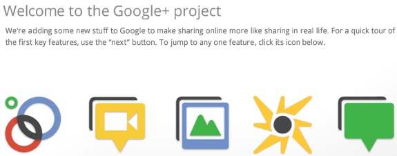
Underneath, however, there are some rather elegant features, including a lovely "Circles" interface to add friends, and a "Hangout" group video chat feature that holds promise.
But users used to Facebook's minimalist interface may find Google+ jarring. And, sad to say, Google's "field trial" suffered from overcapacity, an issue which may or may not have rippled into our evaluation on Tuesday afternoon. I and other staffers experienced numerous annoyances, which resulted from either poor design decisions, alpha glitches, or the overcapacity issue - I don't know which. Read on for our full hands-on with Google+.
But two features - Hangouts, and the automatic, unlimited photo and video uploading from Google+ Mobile - should make Google+ moderately successful. For those reasons, I'd recommend you check it out, when more invites become available.
Google's Google+ is part of the Google network of sites, and on my screen, a "+Mark" appeared first on a black bar, followed by Gmail, Calendar, and the other sites. Within Google+, four icons always appear at the top of the screen: Home, Photos, Profile, and Circles.
Profiles
Before you can do anything else, Google wants to know a little about you. If you're a Google user, chances are you've already filled out a profile: who you are, where you work, your education, where you've lived, et cetera. While it's not thrust in your face, each field has a privacy dropdown box attached to it: do you want to share it with anyone on the Web? With your private Circles?
You can even specify a custom privacy setting, of a sort. (Hint: when the "Custom" dropdown triggers the field, click the "x" next to the green "Public" box, if it's there. This allows you to customize the "Bragging rights" field, for example, so that your prowess in mud wrestling is only viewable to either a specific circle, or just to a few people you specify by email address.)
Circles
Google supplied me, and PCMag.com, with fifteen invitations to Google+, enough for a robust social network. Google's unexpected announcement of Google+ threw me for a loop, however, and instead of having time to solicit Gmail addresses for our staff, I entered their PCMag.com email addresses and sent out the invitations. And there was another wrinkle: almost immediately, trying to use the invitations returned an error message reporting that Google+ was over capacity. So much for cloud computing, hmm?
Fortunately, the capacity problems cleared, and I and other staffers logged on. But then another problem manifested, spoiling one of the more elegant aspects of Google+: Circles.
To add a contact to Google+, you need to enter your Circles, which are separated, by default, into acquaintances, friends, family, and "following," which apparently is for people who you don't want to interact with, but merely admire from afar. You can also create your own Circle, and define it as you wish. Obviously, this addresses one of the overt weaknesses of Facebook: without configuration, all of your friends are lumped together into one big group.
Adding a friend to your Circle is as easy as typing in their name into the search box. Since you're logged in to the Google network by default, contacts appear as boxes that can be dragged down into various circles, together with a nice circling animation.
The problem is, however, is that Google pulls up all of the user's email addresses: work, Gmail, AOL, Yahoo, whatever. In my case, I would have expected that dragging down my co-worker's pcmag.com addresses would have added them into my circle. But adding them didn't work, or at least not right away Was there a delay? Or did the fact that they added me into their circles, notifying me, close the...er, loop? In any case, my initial Circles included some redundant friends; removing them popped up a red "-1" icon - Google's version of the unLike, perhaps?
In any event, my co-workers came through. I soon had (virtual) friends, and it was back to the Stream.
Stream/Home
Oddly, there is no "Stream" icon; clicking the "Home" button takes you here. Think of the Stream as Google's version of the Facebook Wall: this is where your friends can post updates, comments, issue +1 "likes," share content, you name it. And, considering all of the options available to all of your friends, expect the Stream to clog pretty quickly.
In fact, adding Vic Gundotra, Google's senior vice president of engineering, to my Circles may turn out to be a mistake: his initial two-line post on launching Google+ attached an image of the Google Blog, a +1/Comment/Share line, a one-line list of who had shared the post, a one-line list of comments, recent comments, recent comments... Basically, combined with the generous spacing between lines, Gundotra's post dammed the Stream.
On the other hand, Google executives recently offered two visions of its social future, including a way to share knowledge within a company, like Yammer. The Google+ Stream could certainly perform this role.
Fortunately, you can also choose to see which version of the Stream you wish (Family, for example, or Acquaintances). This trims the clutter somewhat. And the rest of the left-hand margin is taken up with Sparks (more on that in a second) and a list of contacts who you can chat with. Unlike Gmail, there is no click-to-call option, but voice, video, and text chat options are available.
The right-hand margin shows small icons to indicate who is in your circle. I was saddened to see that Google recommended I befriend my late brother, but what can you do?
Google+ also makes available two other options in the right margin: Hangouts, and Google+ Mobile.
Hangouts
Hangouts, group video chat using Google's video chat, may be one of the killer features that prompt customers to leave Facebook. Anyone can launch a Hangout, and when they do so, it shows up in the user's Stream. Clicking on the Hangout opens up a video chat window; a Google spokesman said that up to ten people can participate.
News director Pete Pachal and I tried it out; although our San Francisco office has a notoriously bad DSL connection, the video actually stopped for about ten seconds, although the audio worked fine. I'm going to give Google the benefit of the doubt here; Skype calls from the San Francisco office have often proven problematic, as well.
Google reportedly includes software within Hangouts that prioritizes the speaker in some way; we'll have to try it in a meeting format and see how that goes.
Sparks
Google has offered Google Alerts as part of its Gmail email service for years: users can sign up to "follow" news on a given topic. Actually, Alerts works pretty well, and I've idly followed a few topics for years. I regret to say Sparks is nowhere as effective.
Users can follow virtually any topic; I chose "tech news" just to see how it worked. Again, Google's generous spacing allowed for just four results: a story on an upcoming movie, World War Z, from Variety; a TheNextWeb daily podcast, a story from Go.com, and a BusinessWire release on "FinTech 100," whatever that is. Blech. Maybe Google+ should use Google for its search algorithm; I hear it's pretty good.
On the other hand, choosing a pre-selected topic, "Comics," showed more relevant results. So there's hope.
Google+ Mobile and Photos
You'll probably wonder why Google devoted an entire icon to photos. But if you download the Google+ app for Android, you won't.
Google+ for Android is supposedly for Android phones running version 1.8 of the operating system and above; I was only able to load the app on the Samsung Galaxy Tab 10.1, however, and not my Sprint EVO 3G phone.
What makes Photos shine, however, is that each photo your tablet or phone takes, however, is automatically uploaded to a private, personal archive within Google+. Photo and video uploads, as long as they're from your phone or tablet, are unlimited. Google hasn't placed restrictions on the number of albums, the photos, or the file size. Google will only resize photos over 2,048 by 2,048 pixels, and limit uploaded video to just 15 minutes. But even then, Google allows up to 1080p resolution. Apple's iCloud may be forced to offer the same.
(Facebook also allows unlimited photo uploads, although users are restricted to 200 photos per album and 100 photos per mobile album. Users can also upload videos at up to 720p resolution.)
Photos can also show you photos from your circles and your photo albums presumably from Picasa. There's also a dedicated section for "Photos of You," which makes me a bit suspicious: is Google trying to tease me into teaching it what I look like?
And then there's Huddle, a sort of BlackBerry Messenger for the Android platform. Users can group chat, deciding on where to go for lunch or other weighty decisions. As you can see from the slideshow, however, I couldn't get it to work.
The bottom line
Regretfully, we gave Google Wave a pass, because of its potential. Google Buzz proved more annoying, and it flopped after serious privacy concerns doomed it.
Google's UI continually reminds me of a university research project: look past the clunky, utilitarian interface, it seems to say, and behold the wonder of my back-end capabilities. Unlimited photos! Multiple privacy settings! Video chat! The format annoys you, you say? The format?!! You just don't get it.
In the meantime, however, Google+ could stand to use some tightening. The problems with inviting people to Circles is a frustrating flaw, but one that may have been an alpha glitch. And no cloud company, let alone one like Google, should ever post an "over capacity" message. But while Facebook's default font might be a smidge too small for my taste, the site uses space effectively.
Take a page from Apple and Facebook, Google: decrease the white space between Stream posts, and provide an easy windowshade or arrow toggle to compress long posts by default. Maintain the complexity, but let the power users dig deep and discover it.
Facebook is the incumbent; Google+ will need to offer something new and innovative to lure people away. For some, Google's automatic mobile photo and video uploads, plus the Hangouts feature, will do this. The smart money says that Facebook's reported 750 million users is a mountain too steep to climb, and then there's Google's history - once Buzzed, twice shy.
But any free, innovative product is worth a look, and if you use Gmail, then you'll eventually get access to Google+. Let's hope it's more polished by the time it launches.


