Windows 7 disc layout 2 - Windows 7 Screenshots
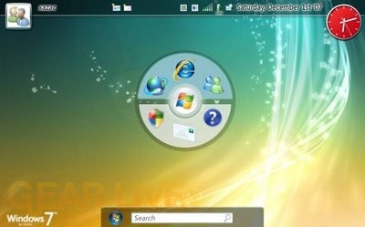
Again, this Windows 7 layout is reminding me of the operating system found on the OLPC.
Back to thumbnails | View full size image
| ‹ | Windows 7 with multiple windows open | Windows 7 picture flow | › |






Comments
You can make the Outside look pretty all you want windows. But please just work more on what is under the ‘hood’. Dont build on VIsta. Start a fresh and Optimize from the ground UP.
posted by: Dontknow · 6/1/08
Agree with DontKnow, start a fresh one with Windows 7. Also, it still reminds me of a Mac.
posted by: BoogerJay · 6/1/08
why would you like a big disk in the middle of your desktop
posted by: acid2k1 · 6/2/08
Red clock and the bottom bar not looking good.
posted by: Crater · 6/3/08
I dont like this one I like the transperancey look. That disc is just there no design or nothing.
posted by: littlebull · 6/3/08
The disc still puzzles me, but out of all the ideas they have presented so far, this one is the one I like the best (which isnt really saying much since I have slammed every image so far)—I do like how they implemented the bar at the top though, and kept the windows button at the bottom
posted by: BuckeyeFanatic25 · 6/5/08
i think this will be a pretty neat update of the same old layout, what i had in mind was the windows phone layout a possibility…Any chance we can get to try out this layout and get a better idea on how it is?
posted by: juan lopez · 10/31/11