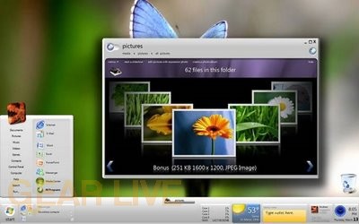
Windows 7 picture flow - Windows 7 Screenshots

Cover Flow makes its way to Windows?
Back to thumbnails | View full size image
| ‹ | Windows 7 disc layout 2 | Windows 7 transparency | › |

Cover Flow makes its way to Windows?
Back to thumbnails | View full size image
| ‹ | Windows 7 disc layout 2 | Windows 7 transparency | › |
Comments
That looks freakin awesome. Makes browsing images ALOT easier, for me anyway. Thanks for the image!
posted by: BoogerJay · 6/1/08
that does look alot easier for people
posted by: acid2k1 · 6/2/08
The white bar looks cool, but they should keep the sidebar.
posted by: Crater · 6/3/08
Oh I like the backgrounds you can choose from they look real. They look alot more clearer then vista. And easy navigation through them also
posted by: littlebull · 6/3/08
The taskbar looks really bad still, I don’t think they (the sidebar and the taskbar) should be integrated quite like that… However the “pictures” window is very intriguing. And you are right, it does remind me of Cover Flow, but it is a really efficient way to look through pictures. They started to notice this general idea when they started designing Windows Media Player 11 with the album art, and hopefully they will build it into Windows 7 natively!
posted by: BuckeyeFanatic25 · 6/5/08
I like the way they have designed this so far. My favorite thing so far is the desktop. I like the way you can decorate it many ways. Seems they designed a few things differently with this one which to me makes it exciting and I cant wait to see it in person!
posted by: littlebull · 6/5/08
Pictures make great decorations around the house
posted by: Kathy Leland · 6/6/16