Windows 7 media player - Windows 7 Screenshots
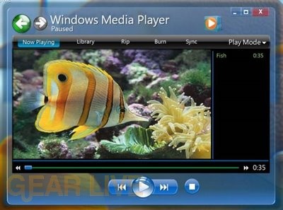
Here is a look at the early version of Windows Media Player in Windows 7.
Back to thumbnails | View full size image
| ‹ | Windows 7 app wheel | Windows 7 Live Messenger | › |

Here is a look at the early version of Windows Media Player in Windows 7.
Back to thumbnails | View full size image
| ‹ | Windows 7 app wheel | Windows 7 Live Messenger | › |


Comments
Lookes like a setup of the media center mixed with the windows media player
posted by: crazygamer8451 · 5/31/08
with the media player i dont like to see so many big buttons i like more viewable area instead of buttons i dont like the lay out of this media player
posted by: mental tiger · 5/31/08
Doesn’t look like they’ve changed much from Media Player 11, but it might just be me.
posted by: BoogerJay · 6/1/08
to me it looks the same style
posted by: acid2k1 · 6/1/08
yup, the preview of WMP 12 seem doesn’t changed much from its previous WMP 11,but for functionality, stability and performances i do hope for a significant increasing performances
posted by: nichan · 6/1/08
Wow, Windows 7 Media Player looks great. It is very neat, not so mess with lots of button or other options. It gives a relaxed look.
posted by: Linu · 6/2/08
Looks pretty compact. Not gonna do.
posted by: Crater · 6/3/08
I like the looks of this one it looks smaller then the other ones. Looks like it might be easier to use also.
posted by: littlebull · 6/3/08
This looks a lot better than the current Windows Media Player 11 in Vista… The top row of buttons looks a lot more streamlined, and easier to use, and the transparency of the player makes it that much more appealing to the eye!
posted by: BuckeyeFanatic25 · 6/4/08
it looks smaller to me, i just think that we will be impressed with windws 7. i cant wait to see it and try it in person. i think all of windows 7 is appealing to the eye!!
posted by: littlebull · 6/5/08
It does look pretty nice, but I think the top part of it is a bit huge for my liking. I’m pretty sure I would know it was Windows Media Player if I opened it up and that font is quite large, haha.
posted by: jess1ca · 6/6/08
The new look of Windows Media Player looks better and more futuristic in Windows 7. I like it! I agree with Jessica, there is a lot of extra space within the window. I don’t like the blue color too, but I’m sure that’s customizable!
posted by: SG · 6/7/08
It looks too much like media center than anything else. Hopefully it looks better in the end.
posted by: SmileyXX · 6/11/08