Gallery: Windows 7 Screenshots
Windows 7 Misc screenshot 5
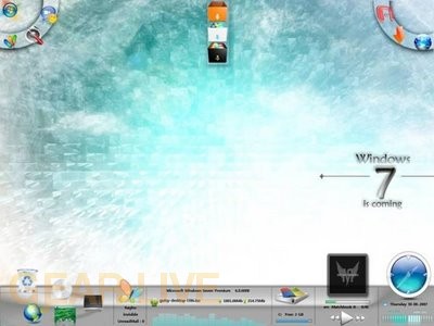
This layout seems too busy to be anything other than something thrown together to see what elements might work.
Back to thumbnails | View full size image
| ‹Windows 7 Misc screenshot 4 | Windows 7 disc layout› |






Comments
Wait, so layouts are completely customizable? If so, awesome! It’d be fun to mess around with your desktop.
posted by: BoogerJay · 6/1/08
its orite nothing special
posted by: acid2k1 · 6/2/08
Background and theme are amazing. They improved it a lot.
posted by: Crater · 6/2/08
yes i think thats what they were trying to get at that they were customizable. but i dont think i would like this one to well, to bright or something just dont fit my style. I dont like the idea that you can change the look of your desktop though
posted by: littlebull · 6/3/08
This is WAY too busy… The bottom looks like a complete mess and would scare away any average user to go get a Mac. The top left and top right only make sense if you are using this on a UMPC, as those are where the touch controls are usually located.
posted by: BuckeyeFanatic25 · 6/5/08
That one hurts my eyes to look at. Way too much going on.
posted by: SmileyXX · 6/11/08