Gallery: Windows 7 Screenshots
Windows 7 Misc screenshot 4
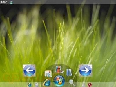
This one kind of reminds me of the OLPC XO operating system layout.
Back to thumbnails | View full size image
| ‹Windows 7 Misc screenshot 3 | Windows 7 Misc screenshot 5› |

This one kind of reminds me of the OLPC XO operating system layout.
Back to thumbnails | View full size image
| ‹Windows 7 Misc screenshot 3 | Windows 7 Misc screenshot 5› |


Comments
Is it me or does Windows 7 show off huge icons, shown in most of the screenshots?
posted by: BoogerJay · 6/1/08
why do you want huge back and forward icons on your desktop
posted by: acid2k1 · 6/2/08
Yeah, the arrows don’t look very good.
posted by: Crater · 6/3/08
ok that layout looks a little confusing maybe because i havent ever seen a layout look like that before. I like the backgroud though looks almost real
posted by: littlebull · 6/3/08
That seems like the most inefficient design that I have seen out of this entire gallery… why would that design make any sense?? The start menu is in the upper left corner of the screen, and yet you have a Mac OS X dock-like thing at the bottom which you rotate through in a counter-clockwise or clockwise fashion. On top of that, it looks like you have “quick launch” icons on either side of that dock-like thing. So much confusion!
posted by: BuckeyeFanatic25 · 6/5/08
Everything is way too cluttered on the bottom middle of the screen. Space some of it out a bit and get rid of the forward and back buttons then it might look pretty good.
posted by: SmileyXX · 6/11/08