Gallery: Windows 7 Screenshots
Windows 7 Misc screenshot 3

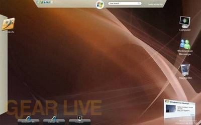
This screenshot shows an alternative desktop layout within Windows 7
Back to thumbnails | View full size image
| ‹Windows 7 Misc screenshot 1 | Windows 7 Misc screenshot 4› |
On Gear Live: Apple’s M5 Chip Made the MacBook Pro Unstoppable!

This screenshot shows an alternative desktop layout within Windows 7
Back to thumbnails | View full size image
| ‹Windows 7 Misc screenshot 1 | Windows 7 Misc screenshot 4› |
Comments
Now THAT looks pretty cool. Easy to use, yet very simple.
posted by: BoogerJay · 6/1/08
yeah looks simple to use
posted by: acid2k1 · 6/1/08
Style is incredible. I guess they are using the Mac dock for Windows now.
posted by: Crater · 6/2/08
It looks something similar to linux (again).
posted by: Shailendra Doke · 6/3/08
ok now i get it it is another desktop layout. i like the fact that there some to choose from. even for the icons thats different from the other window versions
posted by: littlebull · 6/3/08
I do not like the start menu being at the top middle of the screen (at least I assume that is where it is judging from that picture)—it just seems out of place! I do think the 3D popup of the Windows Live Messenger notification is really cool though—I think Windows 7 should build off of the graphics subsystem and add more 3D effects!
posted by: BuckeyeFanatic25 · 6/5/08
I like it, looks real simple to use and very nice to look at.
posted by: SmileyXX · 6/11/08