Find Our Latest Video Reviews on YouTube!
If you want to stay on top of all of our video reviews of the latest tech, be sure to check out and subscribe to the Gear Live YouTube channel, hosted by Andru Edwards! It’s free!
Tuesday September 22, 2009 6:45 pm
Zune HD Review: Music discovery at its finest
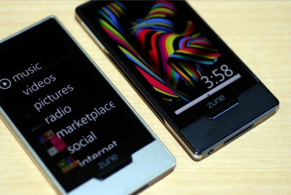
We’ve had the new Zune HD in our hands for a few weeks, and now that we’ve had the opportunity to thoroughly get to know it at an intimate level, we figured it was time to share - but first things first. We’ve gotta say it. Microsoft has been consistently wowing us over the last few months. Say what you will about Windows 7, Bing, et al, but at the end of the day, they are solid offerings that stack of well against their competitors. Then of course, there’s the Xbox 360, which just received a dashboard overhaul, making it even more useful and feature-rich, and there is even more to come this fall. For us to even be thinking about Microsoft in this way is a huge departure from even just one year ago.
So, all that said, where does the Zune HD fit into all this? Well, as we’ve posted previously, the thing has an OLED 16x9 display, and packs in the NVIDIA Tegra processor. Those two pieces of news has us super-excited to see if this thing would live up to the hype. Does it? Go grab a drink and get comfortable, because we are going to delve right in.
ZUNE HD DEVICE HARDWARE
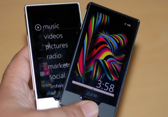
There’s no better place to start than with the device itself. It’s really hard to gauge the size of the Zune HD until you actually see it in person and pick it up. You quickly realize the amount of work and detail that went into designing the product. It consists of aluminum, plastic, and glass, giving it a sort of industrial chic feel. It has hard lines and edges, as opposed to being curved all over like the iPod touch, but that doesn’t make it any less sexy…just different.
The Zune HD is larger than the previous generation flash models, the Zune 8 and Zune 16, but is much smaller than the similarly sized Zune 80 and Zune 120 units. It’s also smaller than the iPod touch. In fact, we could stand for it to be just a bit larger because the screen size feels like a downgrade from the iPhone and iPod touch screens we are so used to, just in terms of real estate. Speaking of the screen, it takes of just about the entire face of the Zune HD, which we think works nicely.
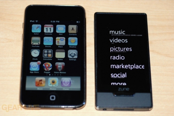
As far as physical buttons, you’ve got three. There’s a power button at the top of the unit, a media button on the left, and a home button under the 3.3-inch display. When the Zune HD is on and in standby, you can use any of the three buttons to turn on the screen. To turn it back off though, you need to press the power button. If you want to completely shut it down, you need to hold down the power button, and then pull down the on-screen “shade” to power it down. As you navigate throughout the UI, you can get back to the main screen with a press of the home button. We’ll get to that pesky media button later.
Both the syncing port and headphone port are located on the bottom of the device. That makes it easier to use in fitness situations.
On the inside, you’ve got the fantastic 8-core NVIDIA Tegra APX 2600 processor. This takes care of the HD video processing, 3D graphics that will be coming in future Apps (like Forza,) all while being a low-power chip. Definitely a good choice. Speaking of power, you’ll get 33 hours of audio listening time per charge, which also amounts to about 8.5 hours of video. That’s superb. One thing you won’t find in the Zune HD is an internal speaker. We don’t like that fact, and wish it had been included.
Lastly, the Zune HD is available in 16GB and 32GB models, in black, silver, green, blue, and red. The green, blue, and red are available as exclusive colors from the Zune Originals site, where you can also get a custom pattern and/or message engraved into the device as well.
Gallery:
OLED SCREEN
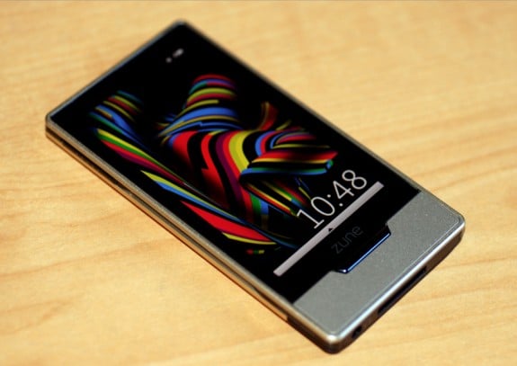
While the actual build quality of the Zune HD is quite nice, you immediately realize that the capacitive 3.3-inch 16x9 480x272 OLED screen is the star of the show the moment you turn it on. If you wanna compare it to the iPhone and iPod touch, those have 3.5-inch capacitive LCD touchscreen displays with 480x320 resolution. So while the iPhone OS devices have a larger screen, the Zune has a true widescreen display, and the OLED technology is just off the charts gorgeous. You get a nice, sharp picture that has great color and deep blacks. The Zune HD also supports multitouch, which is quickly becoming an expected feature on touchscreen devices. I only have two complaints. First, if you use it in direct sunlight, the screen looks washed out. Sure, that is easily fixable, but still, it needs to be mentioned. Secondly, and this may just be a personal gripe of mine, I wish the screen were a tad bigger. Again, after using the iPhone for over two years, going to a screen that is smaller just feels like a bit of a downgrade.
ZUNE HD SOFTWARE
User Interface
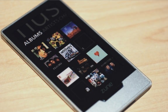
Right off the bat, let’s get this out of the way - I love the new UI. It is sexy, and actually plays off the design of the Zune HD hardware itself quite well. After years of Apple being at the top of the MP3 player user interface game, with every other company falling very short, it’s great to see how Microsoft was able to, in our opinion, build a better UI on their hard drive player than seen on the antiquated iPod classic, and has again made something that is a worthy competitor to the UI offered by the iPhone OS. Scrolling and navigating is very smooth, and when you use the accelerometer tilting feature, it is fast. Way faster than using similar functions on an iPhone or iPod touch, in fact. The zooming in and out effect looks great, and makes you feel like you are diving in and out of the menu, going deeper into a 3D field, as opposed to just moving from one menu to the next. It’s very cool.
Home Screen
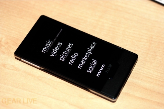
The Home screen is actually two screens in one, in a way. You get the main sectional menu in the main area, but you also get a section on the left where you can pin items and get quick access to content. If you tap on that area it comes into focus, and pushes the sectional menu off to the right. From here you can get to your currently playing content, Pins (content that you always want to have appear here no matter what,) recent history, and newly added material. I think people will get a lot of use out of the New area - how often have you downloaded a bunch of new content to your Zune, only to forget exactly what that content was later on? This takes car of that problem by showing you the last ten pieces of content (songs or albums, videos, apps, etc.) that you added to your Zune HD.
Browsing Content
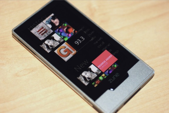
Browsing the content on the Zune HD is almost a no-brainer. I say almost because there are some instances that tripped us up a bit, or where things didn’t work as we expected them to. One example of this is how when you go deep into the menu system, if you want to go one level up, you have to click on the area at the top of the screen, which is really just a few cut-off letters that are a part of the menu option you used to get there in the first place. If there were a back arrow or something, that would be a bit more intuitive. Of course, you can always get back to the main page by pressing the home button, but sometimes you just want to go up a level.
There is a cool alphabet system that allows you to auto-scroll down to whatever section you need to. Basically, in a menu, at the start of a new alphanumeric section (like going from songs that start with an A to B to C,) there is a tile with the letter. you tap that, and it gives you the full alphabet and numbers from 0-9. Press whatever one applies to where you want to go, and you are quickly whisked there. I actually prefer this over the way the iPhone has the side-scroll for accomplishing the same task, although I bet people will be split here.
AUDIO
Now Playing
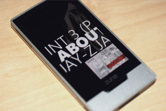
The Now Playing screen shows a lot of the fit and finish that the Zune team put into the Zune HD. When playing a track, you get a similar Now Playing affect to what appears in the Zune software. Images of the artist, song name and details and more all scroll across the screen, and it is very, very cool to watch.
When you aren’t in that mode while playing a track, you have one-touch access to setting up repeat options, turning on shuffle mode, and liking or disliking a track. However, in order to do things like pause, fast forward, rewind, skip, and adjust volume, you need to first press the media button (or tap the album art onscreen) on the side. That means you need to be looking at the Zune HD. To us, that’s kind of an absurd way to do things. You shouldn’t have to use a touchscreen to adjust volume on an audio player. You can make it an option, but it shouldn’t be mandatory, period.
HD Radio
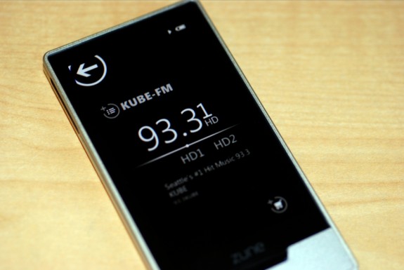
FM radio continues to be supported on the Zune, and this time around it includes HD Radio as well. And you thought that the “HD” just stood for video. Psh. In order to play HD Radio, you’ll need to have something plugged into the headphone port, and since the Zune HD doesn’t have an internal speaker, that’s the only way you’d get to hear any sound anyway, so that’s no big deal. Just know that you can’t browse HD content, even to look at it, unless you have headphones or an aux wire plugged in.
HD Radio gives you potentially higher quality broadcast, and picks up the multicast from stations as well. I say potentially higher quality, because on two different Zune HD units using two different sets of headphones, we did find some HD Radio content to sound a bit static-y. I did notice that the HD logo has 3 levels of brightness when you are listening, and I am guessing that the brighter it is, the better your HD signal. That could be a factor. Still, even if it sounded exactly like FM radio, you still get access to many more stations because of the multiple broadcasts.
The Zune HD also picks up RDS data like the artist name and track title, and displays that onscreen as well. Using that data, in fact, you can tag a currently playing track to be added to your cart so that you can later download it. This is another case where the Zune Pass shines - hear something on the radio and want to download it without forgetting what it is? Tag it, and when you connect to the Zune Marketplace, it’s yours to download. Pretty awesome.
Lastly, you can pause and cache live radio, but you can’t record to save tracks.
VIDEO
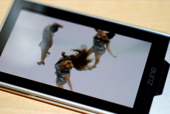
Microsoft is really making a push for video viewing with the Zune HD. I say with, instead of on, because one of the main features is watching HD video on an HDTV. In fact, that is the only way to view high definition content stored on a Zune HD. Yeah, if you don’t buy the $90 HD AV dock for your Zune HD to send the signal out to your HDTV or receiver, then you can’t use it for HD video playback. We hoped we’d see some sort of mini HDMI solution here, because in this case, when you buy a Zune HD, it isn’t really a standalone HD device at all. Oh wait, HD Radio is still on there, so they’re covered. Right?
Of course, you can watch videos on the device as well, and that experience is very nice, due almost exclusively to the OLED screen. When you sync high definition content to the device, it is downscaled to the native resolution of the Zune HD screen, but since the screen is so high-quality, you get vivid color and nice blacks, and it is definitely a step-up from the iPod touch experience, save for screen size. That said, if I had to watch a movie on one of the two devices, I’d go with the Zune HD.
Codec support is limited to WMV, H.264, MP4, and non-HD DVR-MS files (those are from Windows Media Center recordings.) That right, if you have a Windows Media Center, and an HDTV, it’s likely that you record in high definition - but the Zune HD only supports standard-def Media Center files. Go figure.
You can also buy and rent HD movies right in the Zune Marketplace. Sync that to your Zune HD, dock it, and you can watch it in 720p on your HDTV. Video quality is great. Not amazing, but great. I’d say the same thing about the Apple TV and Netflix HD experiences as well. It’s on that level. That’s a compliment for a device as small as the Zune HD, and a testament to the Tegra processor.
ZUNE MARKETPLACE
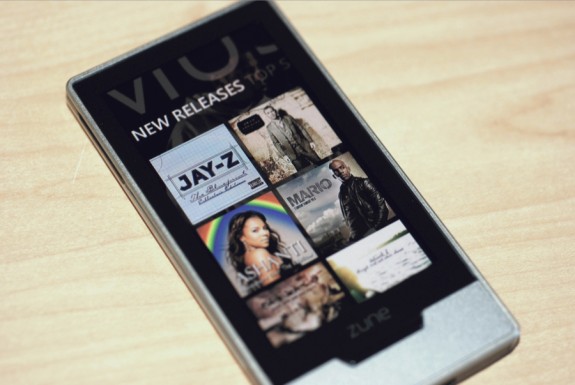
The on-device Marketplace allows you to connect to Wi-Fi and download music and apps on the go. If you are a Zune Pass subscriber, you can also just stream music from the Marketplace, so you don’t have to take up any physical space on your device, which is a nice touch.
You also get a cart, where you can store items you want to purchase, and you can add to it in the Marketplace, and from the radio, as mentioned earlier.
One cool touch is that the Marketplace has custom wallpapers for the different sections, which I think are going to change weekly depending on the big releases of the week. I thought that was great.
ZUNE SOCIAL
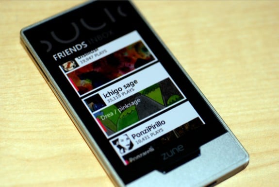
Like previous models, you are able to sync the Zune Cards of your friends to your Zune HD. The actual presentation of the Zune Cards look a lot nicer. You see their avatar, username, number of plays, screen name if chosen, and background. It’s slick. You also have an inbox where you can read messages and find tracks that friends have sent to you. Since the Zune Social and Xbox Live share a platform (which really, really needs to change,) you will see Xbox Live friend requests here as well. You can’t reply to a friend request directly on the device, but at least the Zune HD tells you that you need to connect to the software to see the full message.
WEB BROWSER
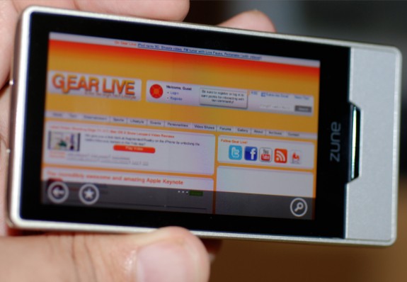
The Zune HD is the first Zune to include an Internet browser, and it uses a customized version of Internet Explorer 6 that supports multitouch, double-tap to zoom, pinch, scroll, and all the rest. The browser will display the mobile version of a site, if one is available. Similar to Safari in the iPhone OS, the Zune HD browser doesn’t support Flash. It’s a good thing, too, because while the device renders pages nicely, it’s very slow. Especially on pages that use even a reasonable amount of Javascript.
The browser also has an on-screen software keyboard that is going to either take some getting used to, or require you to slow down to use with any sort of accuracy. If you do go slow, it pays off, and you can get through typing without messing up, thanks to an animation that shows which key your finger is actually hovering over. Also, due to screen size, the keyboard buries some common symbols two menus deep.
You can also search using built-in Bing support, which makes perfect sense to us. It’s a great browser, and a Microsoft product. Great synergy there.
All in all, the Zune HD browser is more of a “nice to have” than an essential like the iPhone and iPod touch. On the iPhone, we can use the browser for hours without frustration. On the Zune HD, it is almost immediately annoying.
APPS
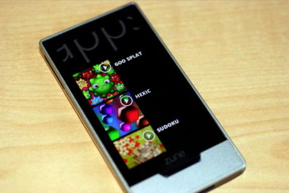
Many expected that we’d see an active App community with the launch of the Zune HD. I mean, look at what Apple has done with their App Store, and all that was required (in a nutshell) was a slick device with a touchscreen. It’s unfortunate that Microsoft seems to be taking a different stance, at least initially, with the Zune HD. Currently, all nine apps are free, and any new ones will be free for the time being, including the upcoming Twitter, Facebook, and Forza Motorsport titles. Microsoft is building all apps that will appear on the Zune HD for the time being, although, the XNA team has released an add-on for XNA Game Studio 3.1 that allows devs to build Zune HD apps. I am guessing we will see third party stuff, but highly managed by Microsoft, similar to Xbox Live Arcade content.
Oh, and one more thing. Pre-roll advertising no apps sucks, Microsoft. Just because the apps are free doesn’t mean that you have the right to shove pre-roll advertising down the throats of users. If you wanna show ads, put ads in the app, using iPhone apps as your example. It’s hard to believe that someone thought that this was the best way to monetize free apps.
FINAL THOUGHTS
So, after all that, what’s our final opinion? Well, first, let’s go over some of the niggles we have with Zune. First, no Mac support is a glaring mistake, period. At this point, there is no excuse for it, no matter what anyone wants to say. I make that statement as a Mac user who uses Zune daily, so that may sound odd…but I’m an edge case. I typically connect to a PC using Remote Desktop Connection, so I can use Zune on my Mac. Another option is using Parallels or VMWare Fusion, and running Zune on that. None of these options are as good as Microsoft just building a native Mac client. It’s not like they don’t have (or can’t get) the resources. It’s been three years.
Another odd decision, in my mind, is the lack of a 64GB unit at launch. Microsoft has been pushing the Zune Pass for years now, and for Zune Pass members, it is likely that they have more than 32GB of music stored. Even more questionable is that the Zune HD is touted for storing HD video. HD video takes up a lot of space, and that would be another reason for offering a 64GB unit as an option for buying who have large libraries and also want to carry around a few HD videos. We hope that a 64GB model will turn up in a few months.
We also wish there was an internal speaker. They have a few games that can be downloaded as apps, and there will be more in the future. It just makes sense that there would be a way to enjoy the games without having to plug in a pair of headphones, but you can’t, and that’s unfortunate.
Gallery:
So, going back to the beginning of the article, we’d have to say that the Zune HD follows the recent trends we’ve seen coming out of Microsoft. This is a new OS, a new hardware device, and an evolution of the Zune platform. In our opinion, the Zune HD is a superb device, and it is worthy of a purchase. Forget about how the original Zune from three years ago made you feel about the brand, because it is long gone. Stop worrying about being ridiculed for owning a Zune. The Zune HD is slick, and it’s enough to make even an iPod touch owner envious…but therein lies the question. Should you buy the Zune HD over the iPod touch? It depends.
We think the Zune platform, on the whole, has a leg up on iTunes as it pertains to music because of the Zune Pass, and the Zune Social. Microsoft has built those two features into a bunch of the sub-features of the Zune HD and Zune as a platform, and those are really what make it an absolute joy. Starting up a Smart DJ playlist that Zune then creates on the fly, based on your listening preferences, and having it include songs and artists you’ve never heard before is just fantastic for finding and discovering new music. It’s way better than the iTunes Genius recommendations, where you have to pay $.99 per track, and hope you end up liking it.
Don’t buy the Zune HD if you want apps. They are currently more of an afterthought or value-add than an ecosystem. Some might call them a slap in the face, what with the pre-roll ads that go so far as to interrupt music you may be enjoying.
All that said, if you want the device that will provide you with the best music experience, that is backed by a platform that enables you to constantly find new music, share tracks with friends, and puts you at the center of your music experience, then we whole-heartedly recommend the Zune HD. The discovery mechanisms are great, the social aspect is superb, and the device itself, is fantastic when it comes to the points I just made. As a true fan of music, I gladly hand over my $15 each month to Microsoft, and haven’t purchased any music from iTunes, save for music videos, in over a year and a half. And seriously, when my one major complaint is that I wish the device had more storage, that’s really a compliment - it means I enjoy the service so much, that I can’t even fit everything on the device…but I want to. Why? Because it is that good.


